Thanks for the feedback fellas! Glad you like the pox walkers and the Iron Golems.
Since then, I've started and aborted a bunch of projects. I went back to work and that has been hectic and busy. I also had to have 10 days fully immersed in The Last of Us 2. It took 10 days because I had to adopt the foetal position, hug myself and cry a couple of times...
In amongst that, I started work on the Lizardmen Blood Bowl team. You know the drill; I choose a real American Football team and try to match their colour scheme with one of the fantasy options. In this case, I decided to do the Detroit Lions. It was also my first real foray into using contrast paints for a large portion of the model (The skin):
On it's own, the skin looks great:

Unfortunately, that skin tone was totally wrong for the colour scheme:


It's just too green. It would look brilliant as a base for a Miami Dolphins type team, but I've already done them. I've shelved that project for a bit, as I was waiting for ages for a blue contrast paint to be delivered (it wasn't and I had to wait for the shops to open again to pop to the local store to get supplies). I know what I'll do once I restart the project, but for the moment I've taken a break from them because they frustrated me a lot when trying my test scheme.
Next up, I dug out all of the Deathwatch minis from the standalone game from a few years ago. I decided, after watching a YouTube guide from Artis Opus, to do the black as a drybrushed scheme. They make it look very simple, so I picked up a box of their drybrushes (I already use their Series S detail brushes...which are superb) and got to work.
Unfortunately I didn't get far; I touched up the black airbrush base layer I put down ages ago and then stippled on a healthy amount of Eshin Grey as a zenith highlight so I wouldn't be working from a flat, black base:

Please note the alarming amount of hair over each model...I swear, living in 1 room with 2 cats that barely go outside, even though the window is open for them 16 hours a day, is going to drive me potty. Hair everywhere all the time. My work space attracts it. It's a proper pain in the bum.
Anyhoo...that's as far as the project got. I'm waiting on anywhere to have Grey Seer in, as that's the next stage of dry brushing. So yeah...another failed start to a project. Gah!
Next up, I decided to work on something that might make some of you quite happy...
Eldar! Aeldari! Craftworlders! Banshees!
Yup, for only the 2nd time on this little log, I decided to work on what everyone else works on most of the time.
The main trouble in the past is that my colour scheme for my Alaitoc Eldar was too busy. I wanted all the troops to have uniformity, including all of the Aspect Warriors. It looks good enough on a tabletop, but it had too many stages to paint and when I look back on the models now, I think that they have too much going on.
For reference, my Alaitoc Autarch:

Technically, it's fine. Indeed, I learnt a few things painting this guy and at the time he was one of my favourite models. However, the blue is very blue and clashes with the red that is really, really red...meanwhile the yellow is jostling for position. The only thing that isn't fighting is the bone coloured elements...and they aren't nearly smooth enough for my tastes now.
Compare that to one of my favourite models now:

The colour balance is what stands out for me. There is only one colour contrasting with the blue and that's the iconic crimson. The gold elements are small enough to not grab attention, while the grey, whites and silver are all fairly cool colours and are colour neutral as a result. My ability with a brush has definitely improved in between painting each model, but not to a degree by which the Autarch couldn't look very similar if I used a better colour scheme.
So what to do about my Alaitoc?
The unfortunate answer was that the yellow absolutely had to go. I never thought it was anything other than silly that the stealthiest of all the craft worlds paraded about with bright yellow helmets. It's bonkers. I also decided to use the red only as a spot colour, not as a 2nd colour that dominates large portions of the model.
The result:


So yeah. Even just looking at those photos while uploading, I've spotted a couple of tiny bits to touch up...I also think another armour highlight wouldn't go amiss in a couple of spots...but generally, I'm really happy. Especially seeing it's my first ever Banshee.
I had tried to do the Power Sword using traditional brushes and glazes and things...but my skills aren't quite there yet. I also don't have my wet palette for working on several models at once. So I attacked it with the airbrush. I try to steer clear of the airbrush for anything other than large models or base coats, but, for 45 minutes' work, I painted 8 swords in total and am somewhat happy with the results. Definitely an area to improve upon moving forward.
So she is my test model, but I have the other 4 in the squad with armour requiring a highlight, but with the power swords complete...so just all the details to do. Actually the quickest part of the models for me. Hopefully I'll bang them all out this week.
I did go back and do the swords on a couple of Crimson Fist Lieutenants and a Captain too:


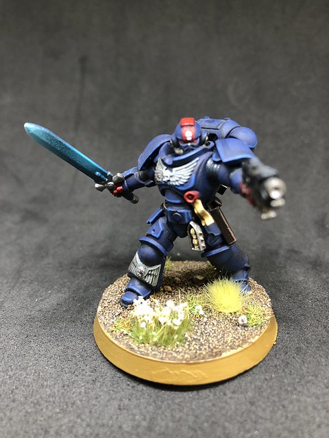
I was struggling a tiny bit with flow through the airbrush by the end, but I just wanted to do something with the marines so that they can stop nagging at me to paint their swords.
So there you go. 1 month, a lot of aborted projects, but 1 Howling Banshee that I'm really pleased with and 3 Crimson Fists that can go back on the shelf and stop haunting me!
I appreciate that this is an absolute wall of text, so thank you for stopping by and taking the time to read my ramblings.
TLDR: I painted a Howling Banshee and failed to paint some other stuff.

